A tricky visual rebrand that was needed after a merger of three nonprofits.
The goal here was to create a unified and inspiring visual brand that could eventually stand on its own
while leveraging the brand equity of the three subsidiaries.
Rural Arts Collaborative isual brand
Rural Arts Collaborative visual brand
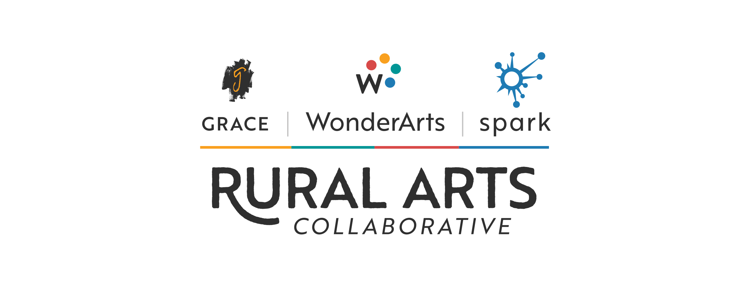
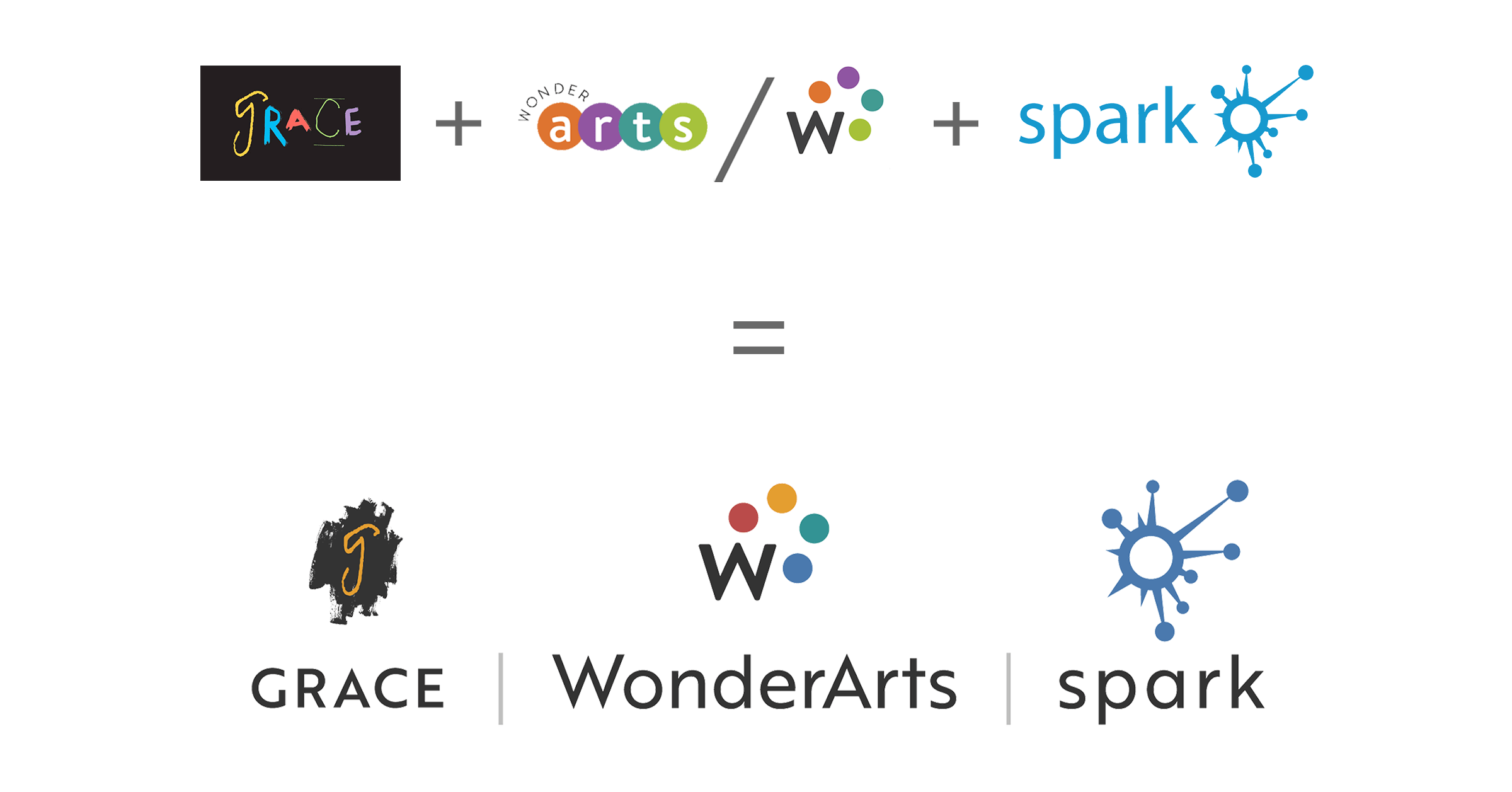
My project plan started with creating a logo lockup of the three subsidiary logos
where I unified the formatting, colors, fonts, and prominence of individual logos.
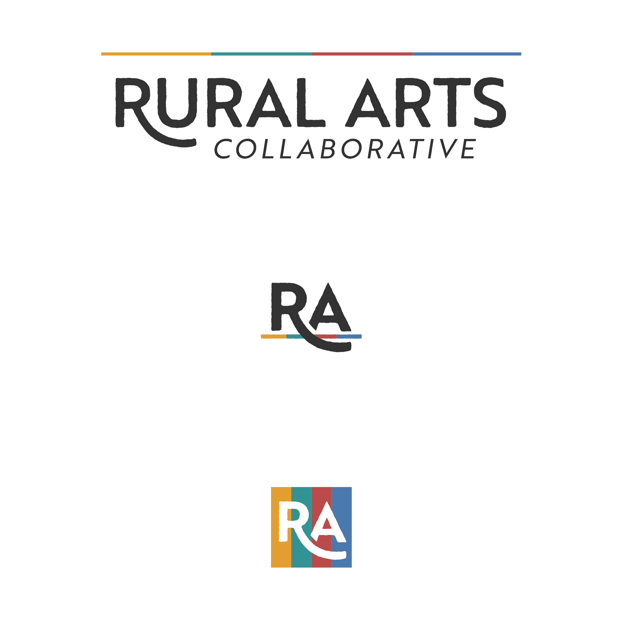
Then I created an umbrella wordmark that would unify the three visual brands by appearing below them.
It couldn’t compete with individual logos but it needed to be recognizable and autonomous.
I created two icon-style marks based on this wordmark.
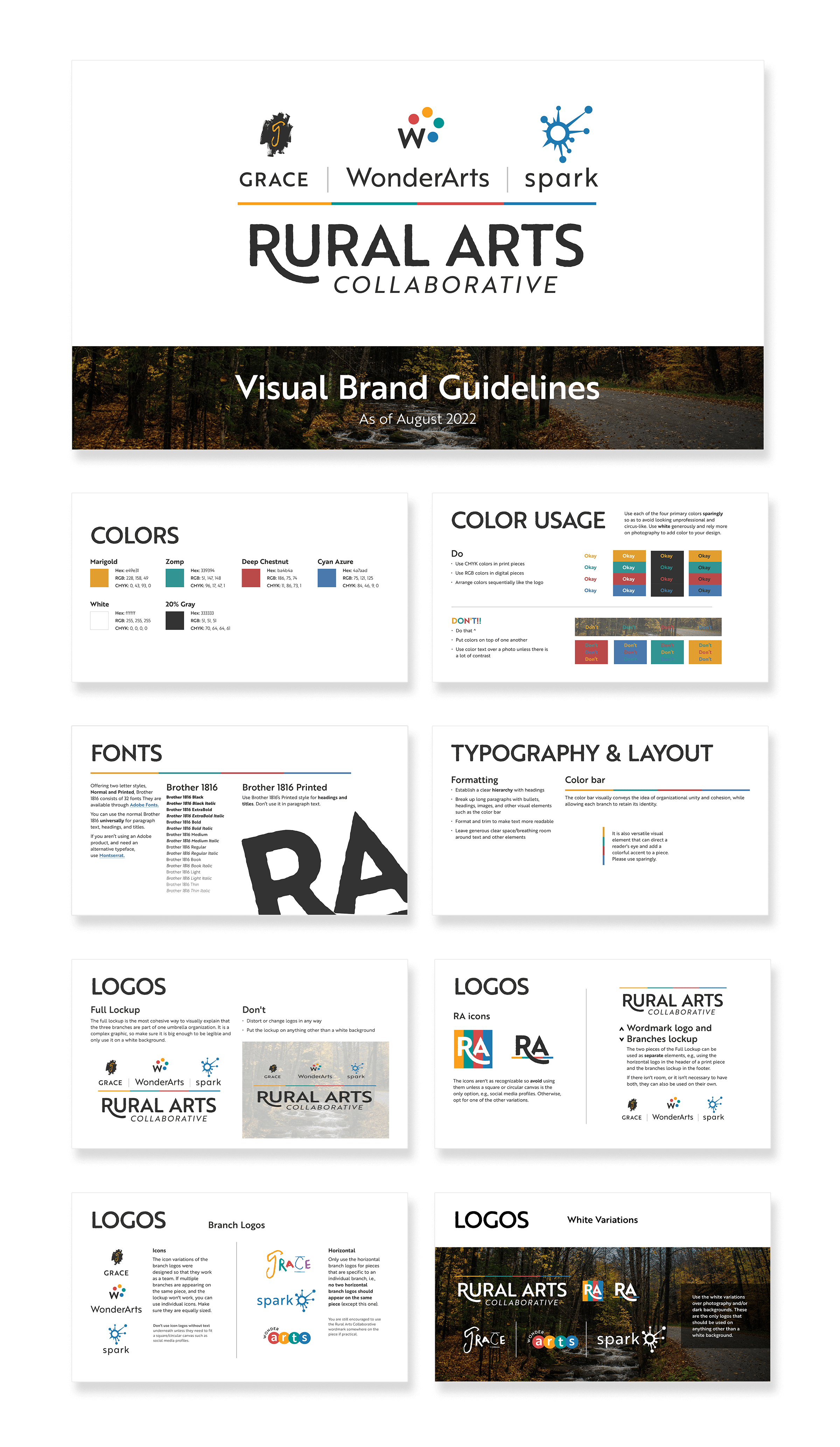
After we made those decisions, I created a short brand style guide, trifold brochure, and a stretch banner.
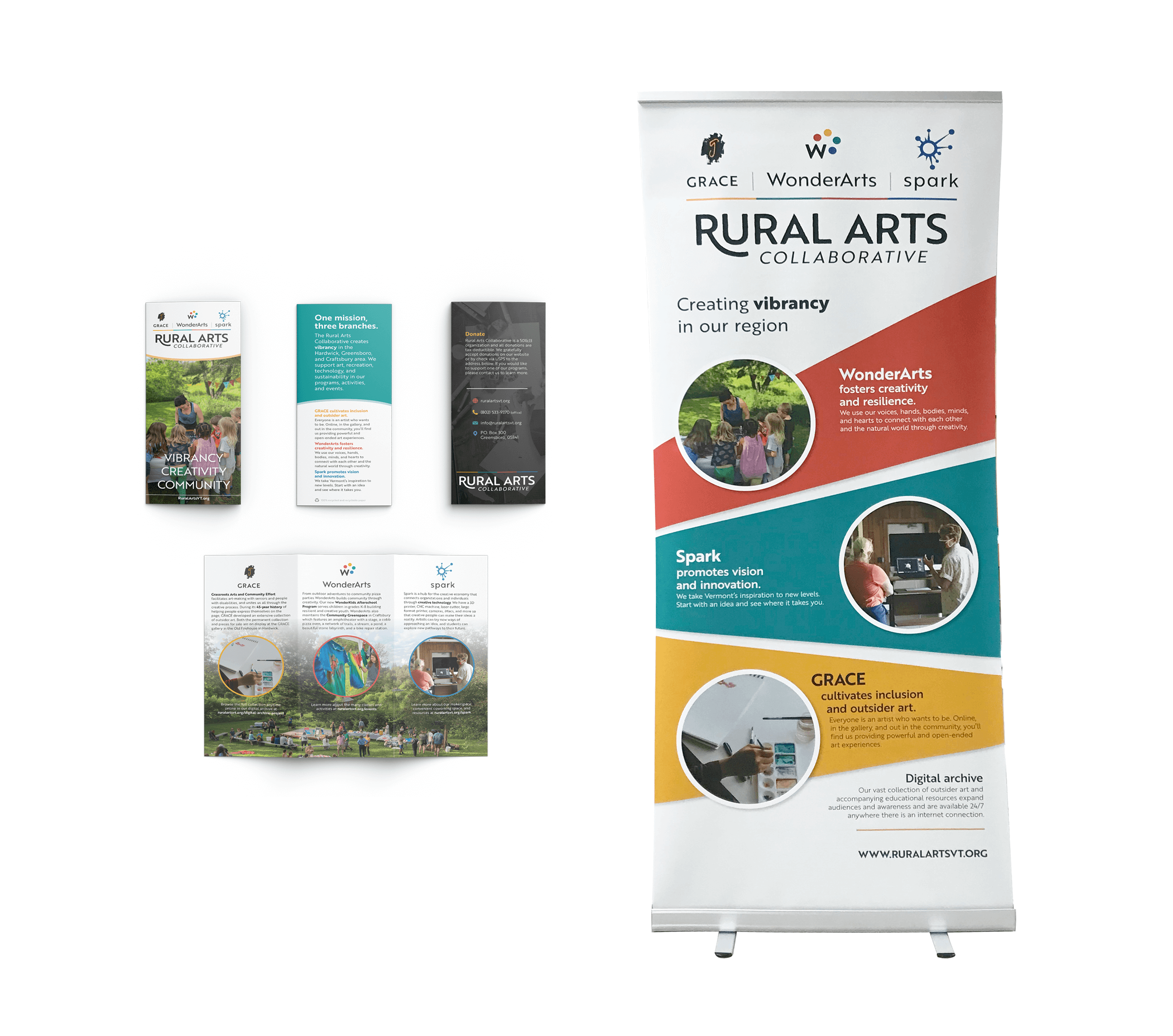
What I provided was a new visual brand architecture that met the client’s goals
of unification, versatility, brand equity, and longevity.

