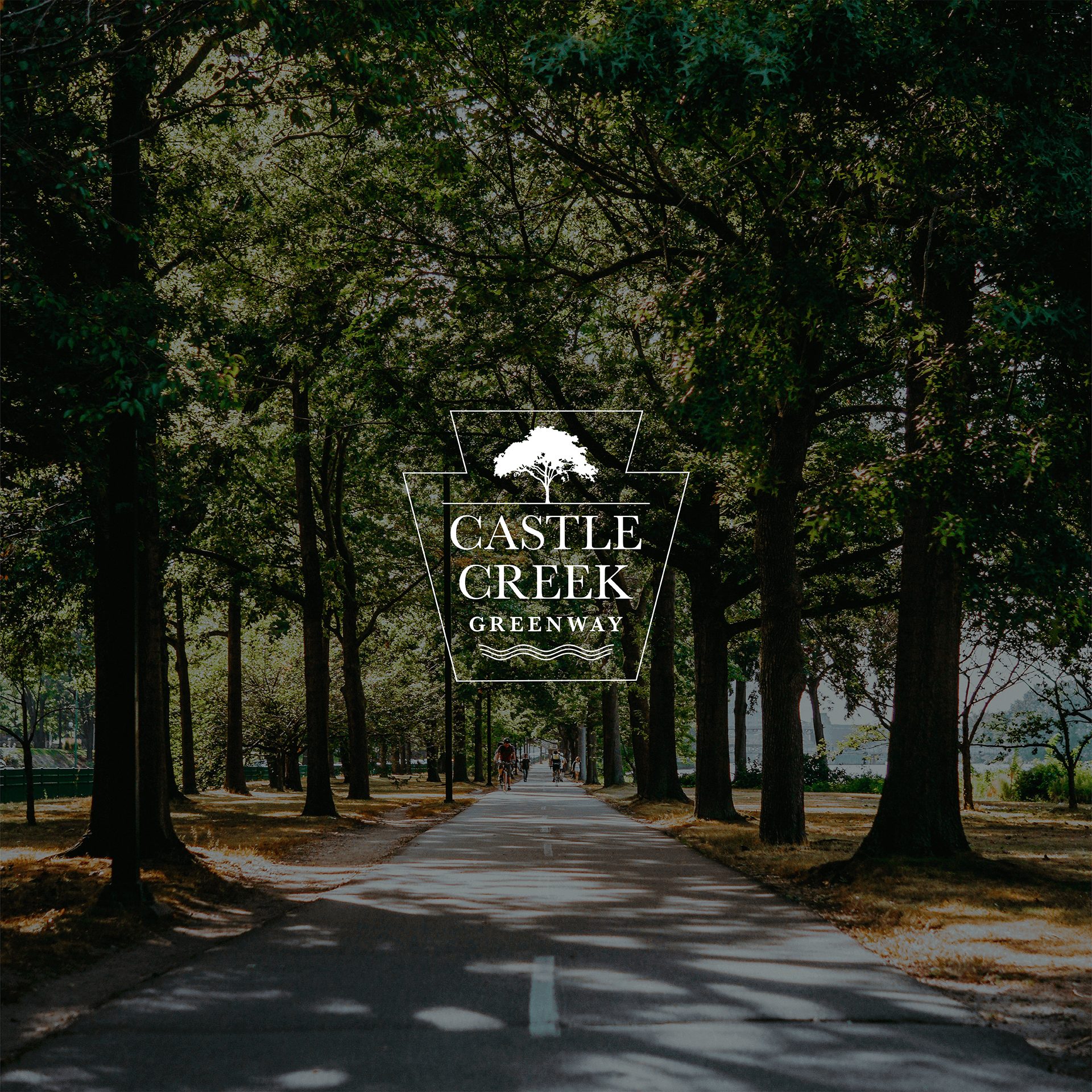
I designed this logo for a bike path that was waiting on easements (and still is as of July 2021). So we needed a logo that would generate some excitement around the project. The logo will act primarily as a wayfinding sign and safety feature so it had to be highly visible and recognizable. We also wanted it to look sophisticated and to pay homage to the former railway that the path follows. I recycled the shape of the old railway sign, added some classic details, and found a green that was just bright enough to look like a traffic sign. Inviting, classy, and practical.
Logofolio, Vol. 2
Logofolio, Vol. 2

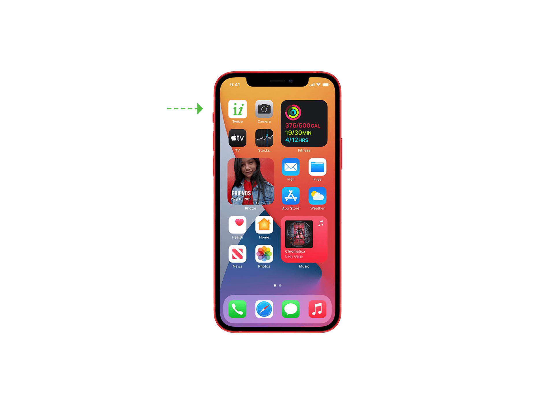
Twiice is a decision-making app that helps organize your thoughts. They needed a simple and modern logo that was friendly and professional. Adding any visual element would distract from the wordplay, so I stuck with a type treatment. One“i” is italicized to illustrate movement and a person in the decision-making process: deliberation, then action.


I designed this logo for a new Galicia-based women’s clothing brand whose market consists of environmentally conscious women who surf, skateboard, and climb. They wanted their visual identity to be peaceful but rebellious; classic but unique. Their clothing is differentiated by its versatility. It can be worn in professional, casual, and active contexts. I emphasized this versatility with some geometric symbolism of cities, mountains, and oceans. These shapes allow for playful geometry and modular components that can be reused in a million different ways.

Annie wanted a unique logo for her flower business that paid homage to her old family farm while creating an effective and versatile brand. The adjectives that we identified for her brand were: elegant, rugged, and nostalgic. I recycled elements such as the flower shape and the font from an old label that they used on the farm.

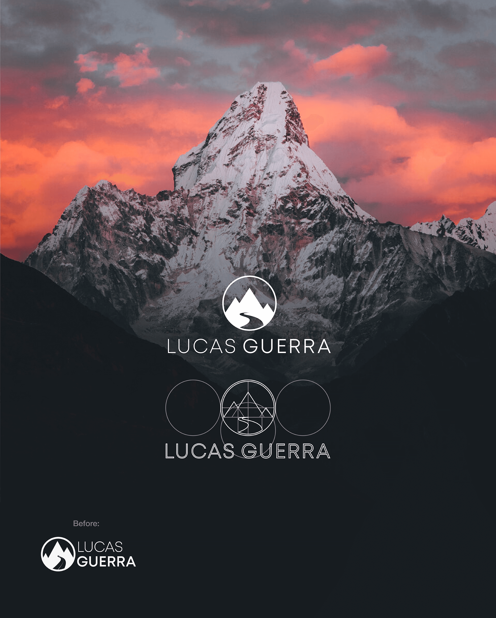
Lucas is a photographer and filmmaker who wanted his personal logo redesigned. We kept his original concept but a few subtle geometric adjustments really elevated the idea.


Craftsbury Village Antiques is an antique shop that specializes in mid-century modern furniture and decor. Jean wanted a classy logo that would stand out by shooting for modern and minimalist. All it needed was a simple geometric flourish.
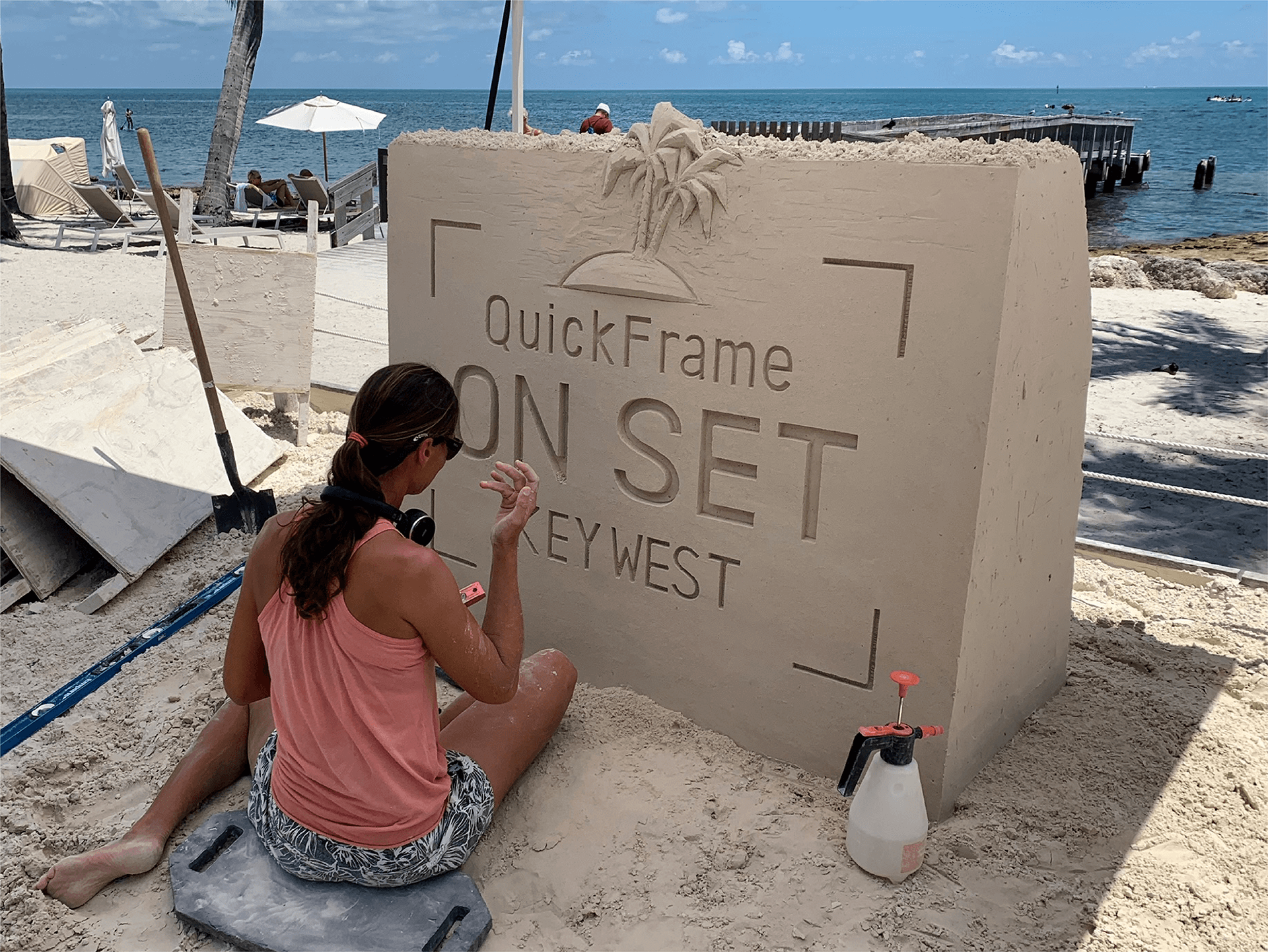
A video marketing company took all of their employees on vacation in Florida and needed a logo to use on shirts, agendas, etc. They wanted to incorporate a camera and palm trees, several of their corporate colors and their font.
The New Jersey Association on Correction was considering a potential rebrand. They wanted their logo to be more attractive, optimistic but they preferred to maintain some brand consistency and recognition. The rebrand has been shelved for now, but I was already pretty happy with the redesign.


