Growpod Farms specializes in creating custom, modular, and stackable vertical farming systems using climate controlled freight container farms. I designed their brandmark in the form of a geometric leaf with a three-color scheme in order to convey growth. It is also meant to emphasize the unique stacking modularity of their systems.
Logofolio, Vol. 1
Logofolio, Vol. 1
This logo was a finalist in a logo competition to brand a spacecraft company that specializes in satellites and in-space service. They wanted a logo that was austere, bold, futuristic, and slightly aggressive.
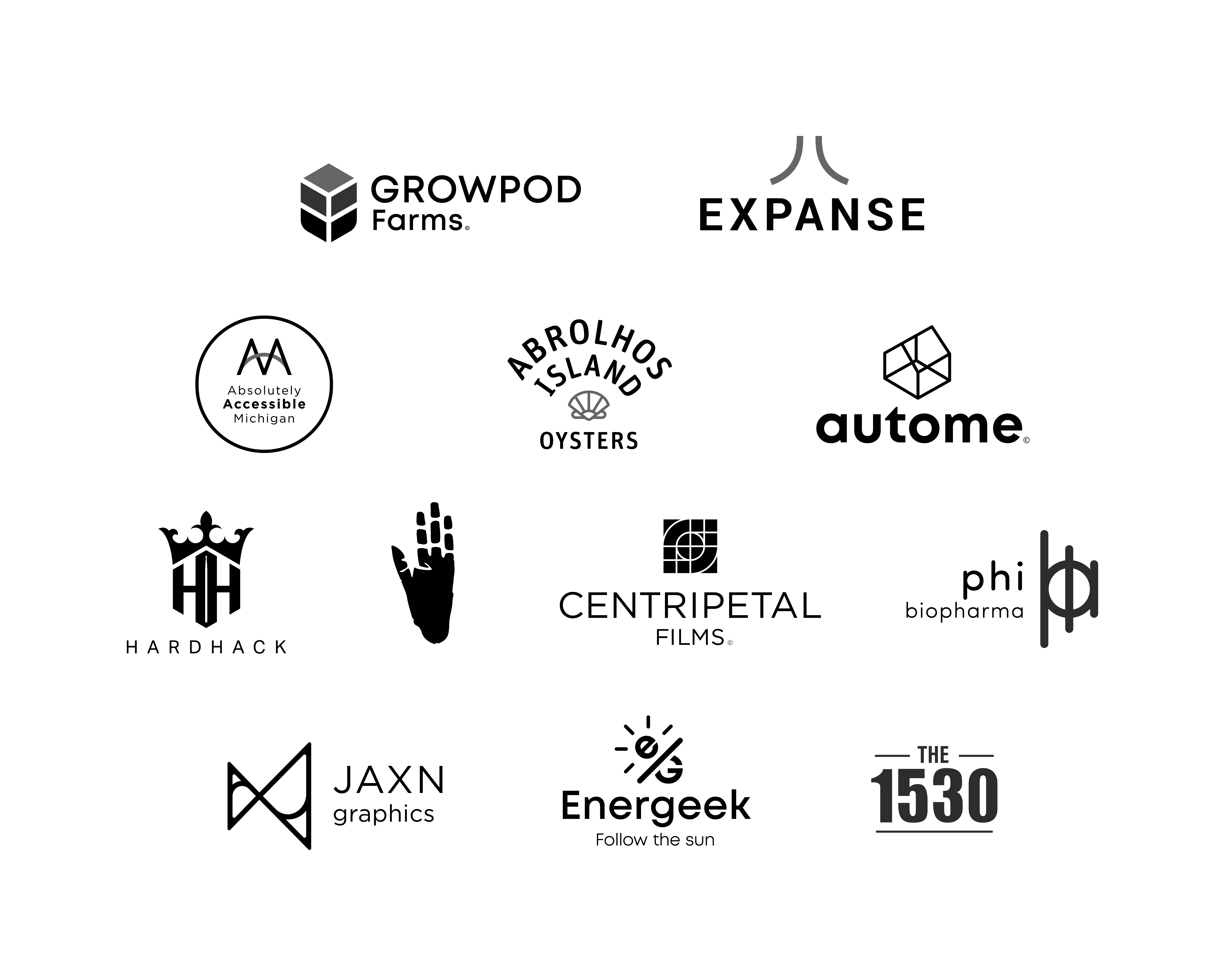
Absolutely Accessible Michigan is a statewide network of disability advocates. Members of the association use the logo as a secondary to their own to show that they’re a proud member of the association. So we wanted it to function as a badge that wouldn’t compete with individual member logos. It was essential for it to be clear and WCAG compliant for a visually impaired audience. They were thrilled with this “bridge” concept that illustrates accessibility and it spells out the AAM abbreviation in an economical use of shapes.
This is a logo for oyster farm startup on Abrolhos Island in Australia. We were shooting for a simple and friendly logo that would look great on a T-shirt. I kept it very simple: an oyster symbol, and the name of the company in the same shape. Super legible and classic.
Autome is a tech company that sells smart home products. We wanted a sophisticated, friendly, and colorful logo that emphasized simplicity of use. The brandmark I designed is an abstract representation of an isometric house symbol.
Centripetal Films is an independent production company that needed a serious and modern logo that would appeal to their target market of independent-minded viewers. Centripetal means “center seeking” in Latin as their documentary projects aim for the core of a story.
Mammalian.art is a personal Instagram page that I created recently for sketches of crazy looking animals.
This biopharmaceuticals startup needed an iconic, modern, and scientific logo that involved the letter Phi (Ф). This logo is made up of every letter in the name of the company superimposed onto one another. Full visual identity here.
Energeek is a residential solar power systems installer. They wanted a professional but approachable brand presence. An ideal logo doesn’t require your audience to read anything before understanding what your organization does so I wanted to make it obvious that they install solar panels.
My logo! So I really had to treat this as my showpiece. I always liked this four-letter spelling of my name so I wanted an abstract and unique shape that would incorporate those letters, a dynamic gradient, and inspiring colors.
